A Mom-to-Mom Guide That Keeps It Simple –
One of the biggest questions I get before every session is what to wear for your family photos. Picking outfits feels like a tiny project wrapped in stress, especially when you’re juggling snacks, nap windows, and trying to convince someone under age five that shoes are, in fact, required. But I promise it doesn’t need to feel overwhelming. What your family wears absolutely influences how your gallery looks—not because you need to dress up or be perfect, but because clothes help the emotion shine through.
But before we dive in, I want to say this clearly: there are absolutely no rules here.
I’ll be thrilled to photograph your family exactly as you are, in whatever clothes you show up in — grass stains, superhero capes, mismatched socks and all. This guide isn’t about perfection or pressure. It’s for the families who want a cohesive feel or love the idea of an elevated color palette but aren’t sure where to start. These aren’t fixed rules or fashion laws. Jewel tones can totally work at the beach. Pastels can be beautiful in the woods. Bright colors can shine indoors. It all comes down to how pieces play together and most importantly how you feel wearing them.
So take what serves you, leave what doesn’t, and always choose outfits that feel like you.
Coordinate, Don’t Match
Let’s start with the biggest styling tip: avoid matching outfits. When everyone shows up in the same jeans and white shirts, the camera loses the definition between bodies. Instead of feeling like dynamic family portraits, the group starts to visually melt into itself, especially with darker shades or identical tops.
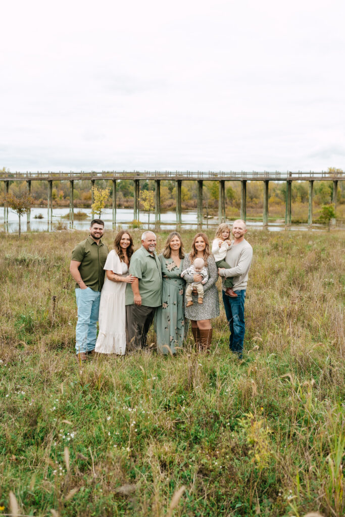
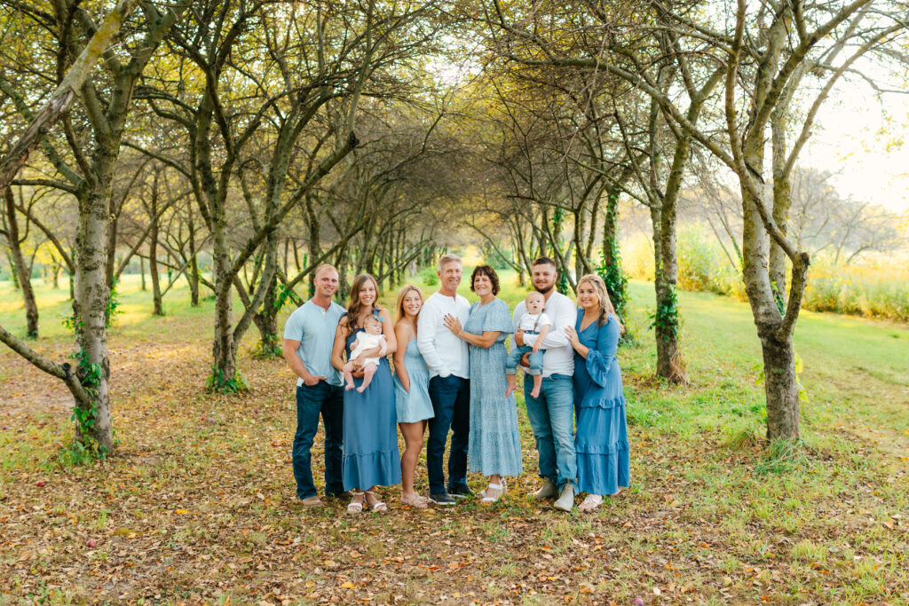
Coordinating, not matching, is the sweet spot. Choose three to five complementary colors and spread them across everyone. Think shared palette, not shared uniform.
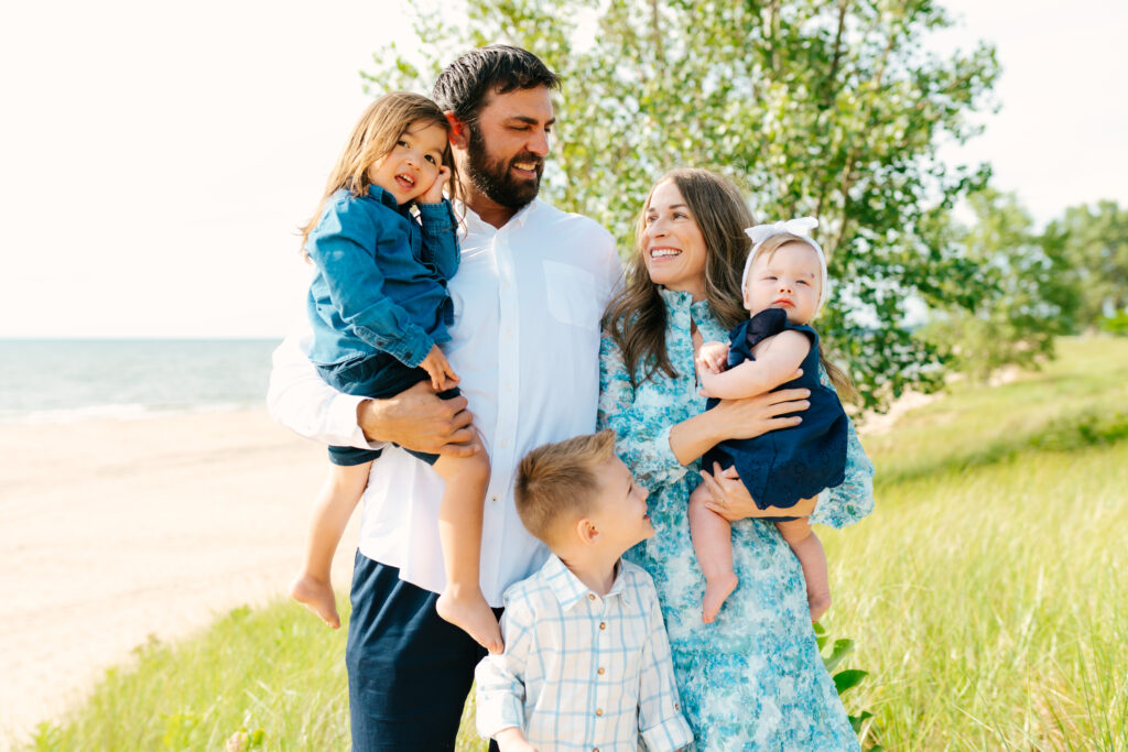
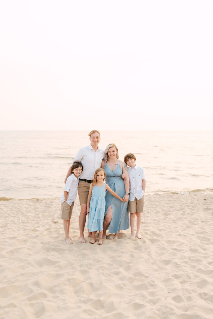
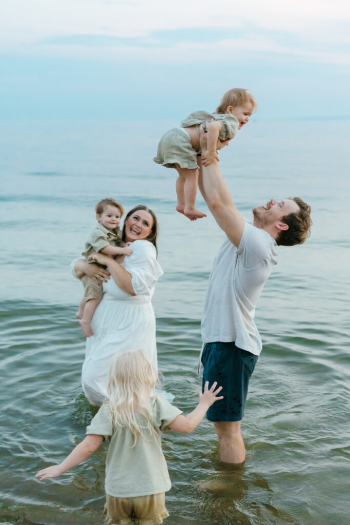
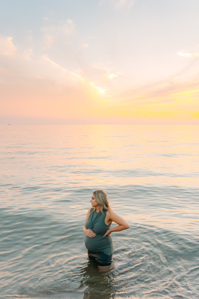
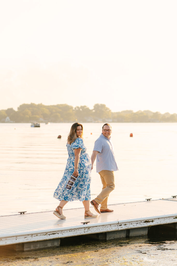
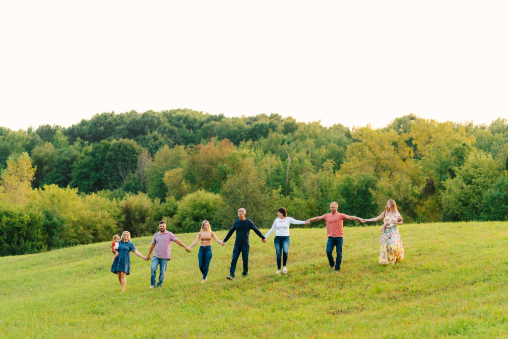
The secret hack most families don’t consider is matching your palette to the location of your session. If you’re ever in doubt, there’s always a shade of blue (or two, or three) that you can throw together that will look amazing in any location. And I’m not just saying that because it’s my favorite color, I’ll include proof below!
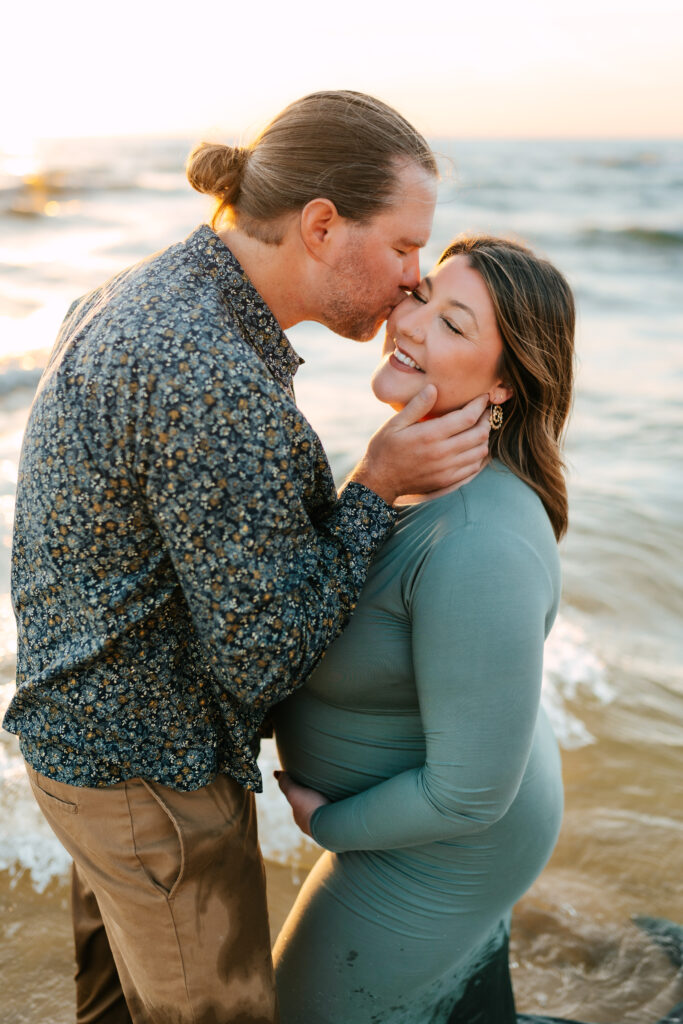
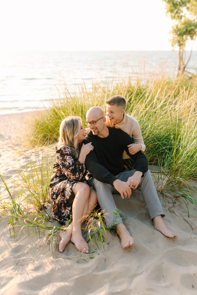
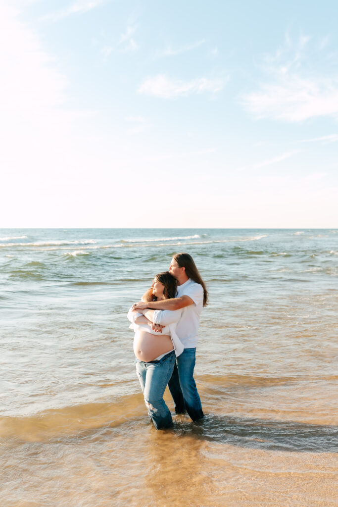
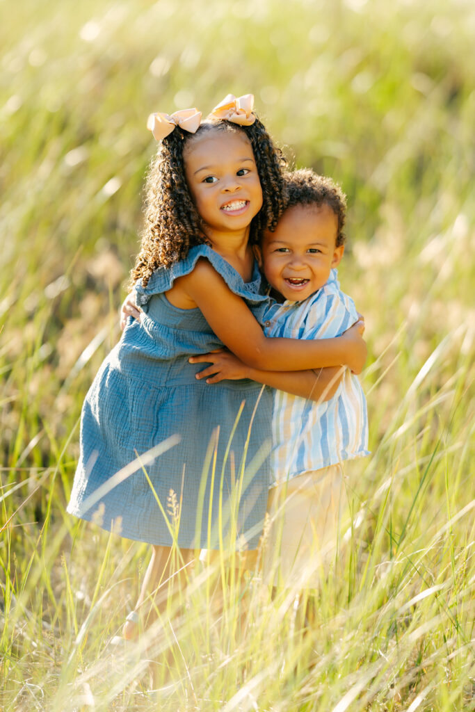
Beach Sessions
Jewel tones feel dramatic in real life but can look visually heavy against sand and water. Earthy tones and pastels (sage, dusty blue, clay, blush, oatmeal, buttery yellow) photograph beautifully in that soft, airy environment. Pair with a sprinkle of one deep shade and *chef’s kiss*.

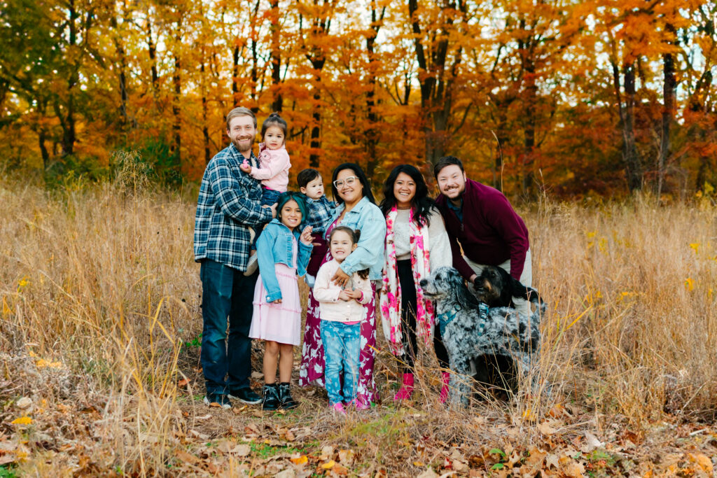
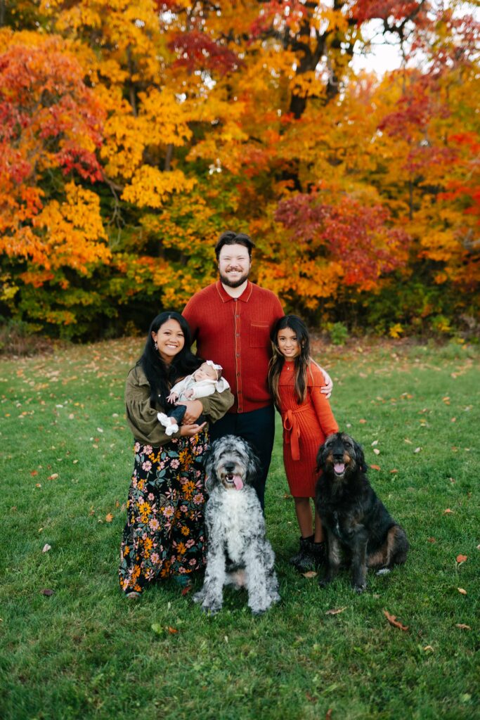
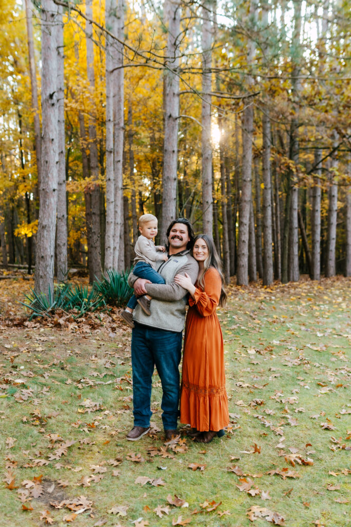
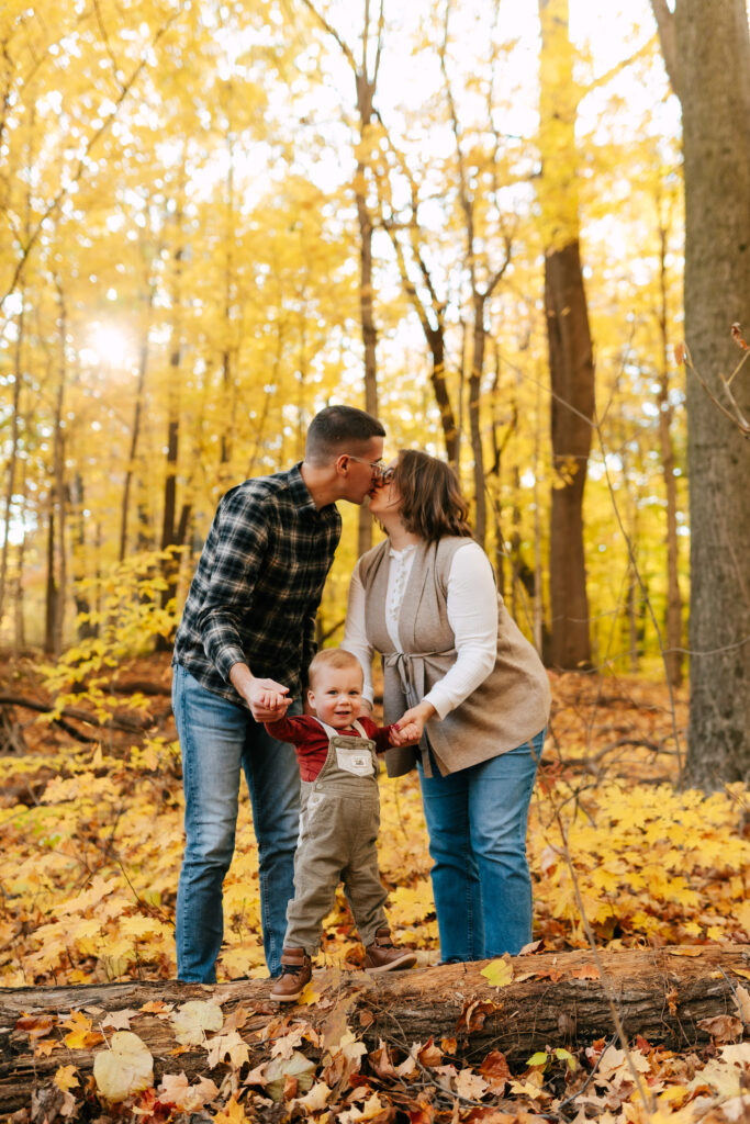
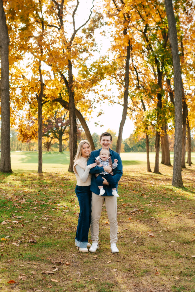
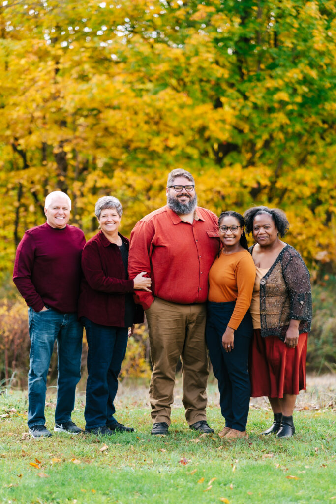
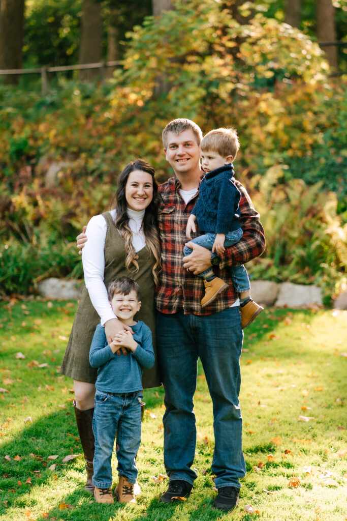
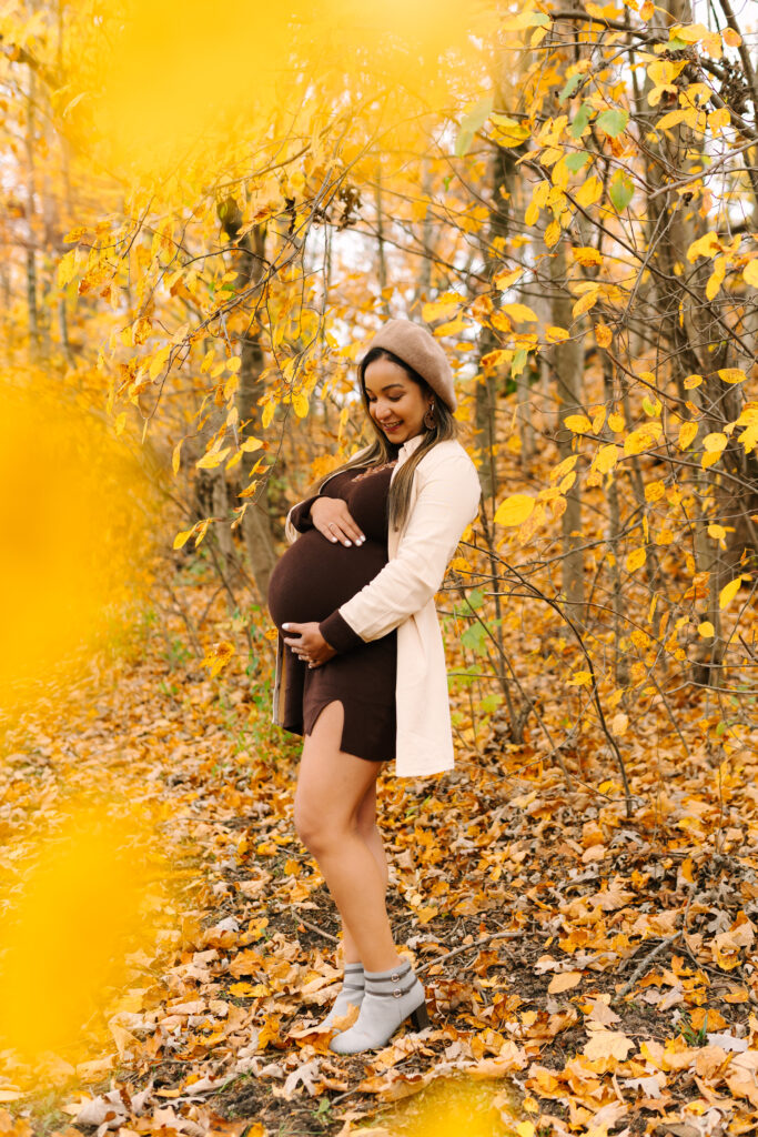
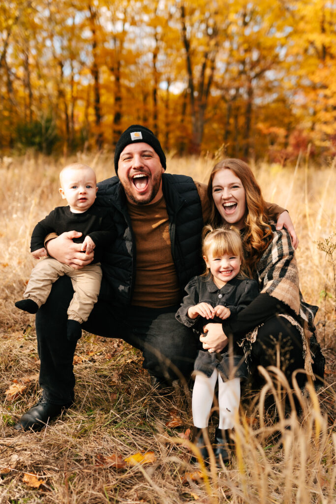
Forest or Wooded Spaces, Especially in the Fall
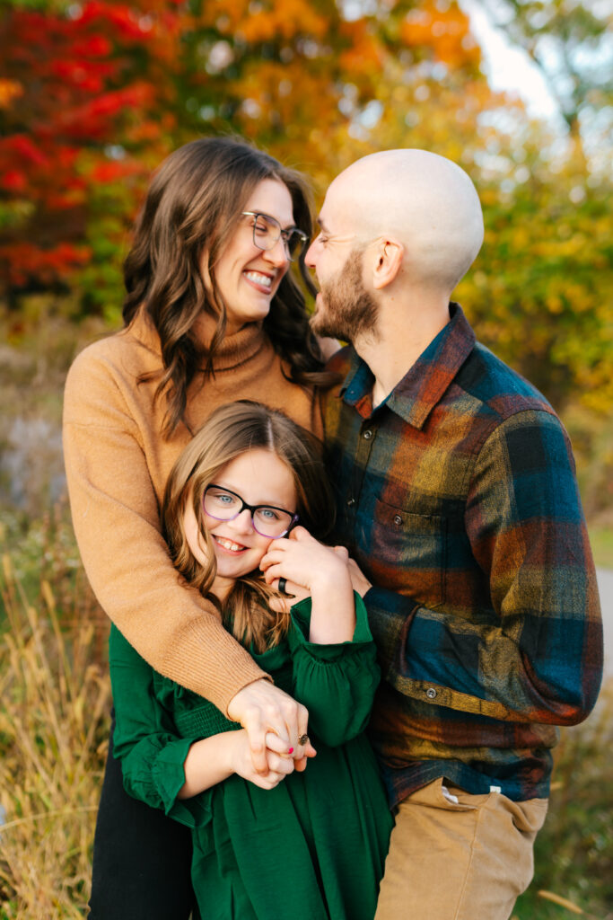
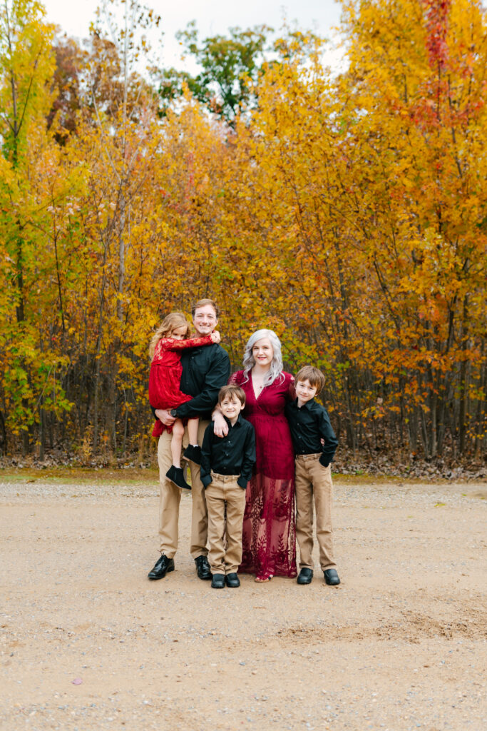
Pastel shades don’t always pop against deep greens and darker shadows. Rich tones like olive, mustard, emerald, denim blue, chocolate brown, and rust offer contrast without overwhelming the frame.
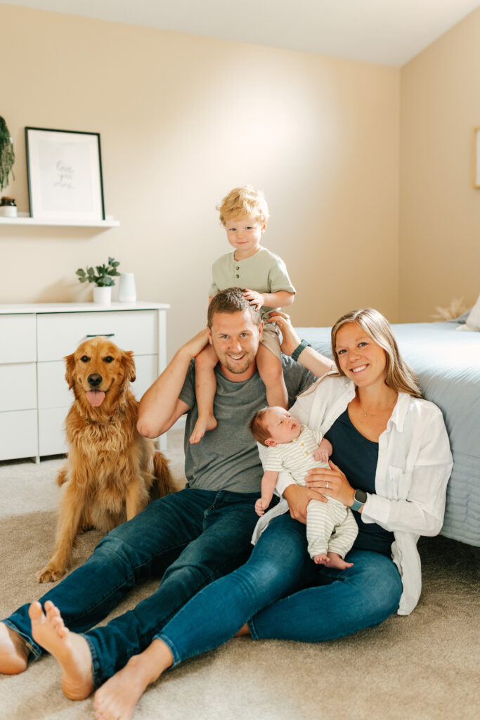
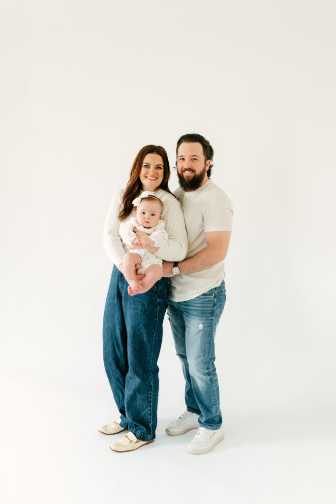
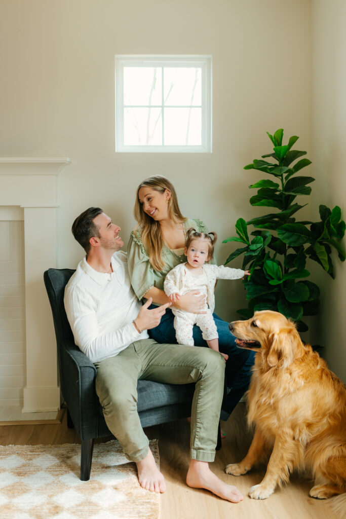
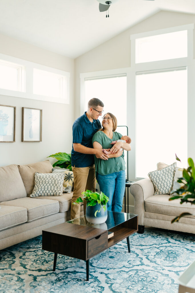
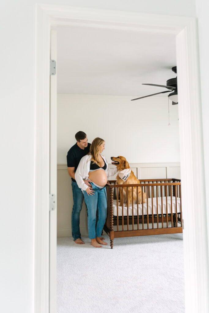
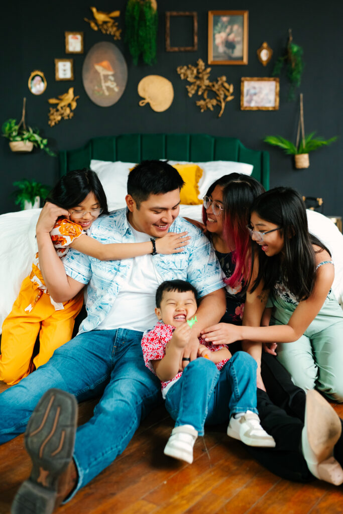
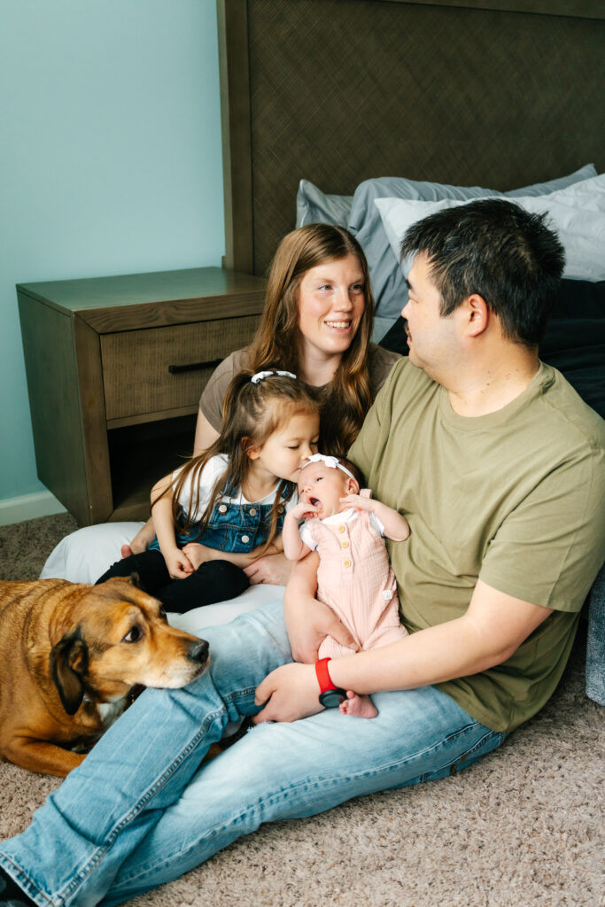
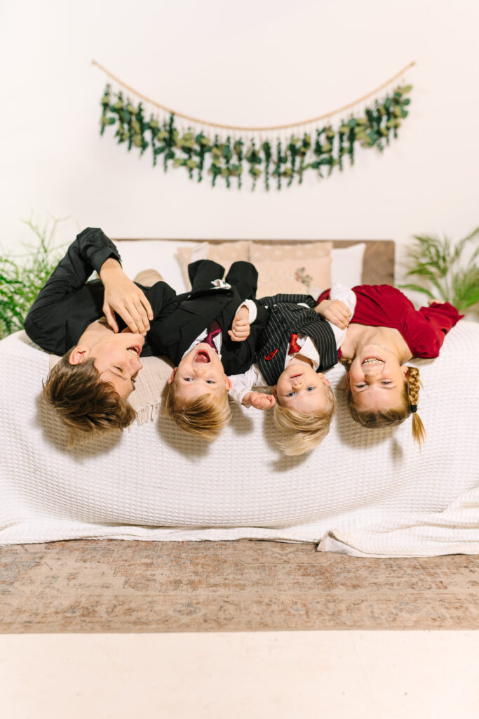
Studio or In-Home Sessions
Neutral or muted palettes shine indoors because the walls, floors, and furniture are usually part of the background. At home, think cozy knits, soft textures, and tones that flow with your decor instead of clashing with it. In studio, creams, latte browns, dusty blues, olive, and mauve always look incredible —clean, calm, and timeless without everyone wearing the exact same thing.

Use your surroundings as a mood board. Let location guide your palette instead of letting the dress you found on sale lead the whole ship.
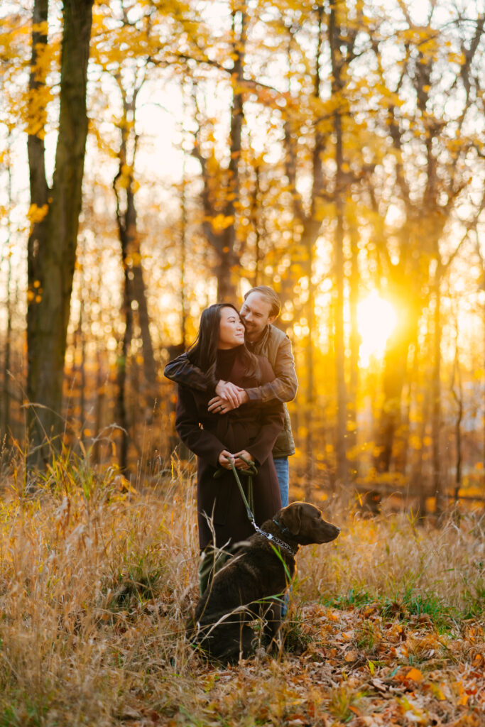
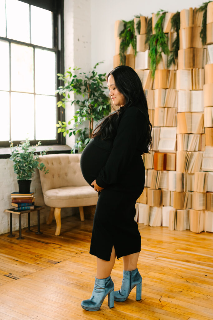
Light Neutrals > Pure White
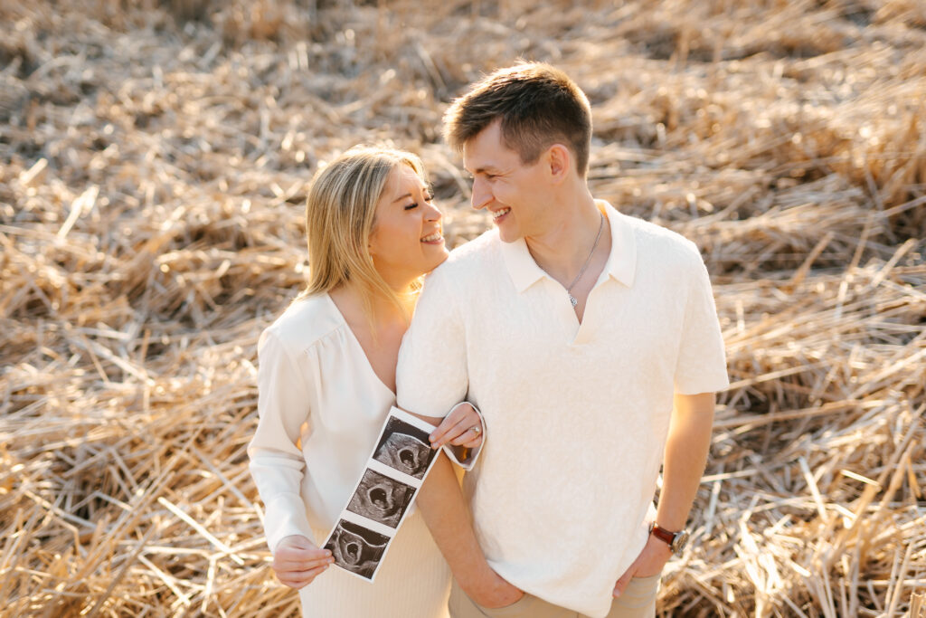
Let’s talk neutrals. Pure white has a reputation for being clean and flattering, but on camera (especially in open skies) it reflects blue tones, blows out highlights, and can wash out skin. If you love a light palette, choose soft neutrals instead.
Cream, ivory, bone, oatmeal, and tan bring the same softness you want while keeping detail and warmth in your photos. These tones are universally flattering, photograph beautifully, and won’t fight the landscape.
Sprinkle Texture, Don’t Pour It On
Texture adds visual interest without screaming for attention. It’s one of my favorite tools to elevate outfits without needing bold patterns or complicated styling.
Textures that photograph beautifully include linen, lace, waffle knit, ruffles, jacquard, gauzy fabrics, and anything that moves with the wind. Pattern lovers: plaid is totally fair game, especially in fall—but use it sparingly. One or two people is charming. A full family of flannel starts to look like a themed costume.
Aim for balance: one standout outfit, a couple of textured layers, and supporting pieces that keep the eye where it belongs: on your faces and your connection.
Accessories Done Simply
Accessories makes a bigger difference than most families realize. For littles, bows, cardigans, layers, and tights add personality. Adults can lean into hats, scarves, layered jewelry, or a simple nail polish shade that makes you feel like your favorite self. And yes, accessorize your pets, too. None of this needs to be fancy, just intentional.

One Classic Outfit + One For Fun
If decision fatigue is creeping in, here’s your strategy: pick one cohesive outfit for everyone that feels timeless. Think no logos, low pattern, nothing too bold or trendy, and a palette that hugs rather than fights your surroundings.
After we lock in your important shots, let kids change into the thing they love—princess dresses, superhero capes, rain boots, wild prints—because those photos tell the truth of who they are right now. Those candid variations are often the frames parents cherish most.
Final Thought: You Already Belong in the Picture
All of this is helpful, but none of it matters more than you being present with your family. Styling is just the frame that lets your connection shine. Choose clothes that feel like you, use colors that play well together, and allow space for real life to happen.
And if you find yourself staring into your closet wondering what to wear for your family photos, snap a picture of your options and send them my way. I love helping you narrow it down and you deserve to feel confident, comfortable, and totally yourselves in every frame.